
Increasing conversions of professionals in the Builder Market Tool
GROWTH DESIGN
PRODUCT STRATEGY
MY ROLE
IMMEDIATE TEAM
UX Design Intern
2 UX Designers
The Builder Market Inc
PROJECT DURATION (YEAR)
9 weeks (2025)
DESIGNED FOR

SUMMARY
CONTEXT
Despite a significant number of monthly visitors, the platform struggled with user retention. Users could only access core value of the platform, after a tedious form filling, creating an effort-before-value barrier.
Additionally, the platform was launching a new feature to sell suggested leads to professionals.
KEY CHALLENGES
How might we redesign onboarding to increase listing completion?
How might we design the flow of converting suggested leads into active leads?
SOLUTION
We redesigned the onboarding experience to front-load value demonstration and reduce user resistance, and designed a new system that allows professionals to purchase and contact leads while protecting homeowners from bombardment.
WHAT IS BUILDER MARKET?
Builder Market connects homeowners seeking home services with professionals who provide them.
On this platform, professionals showcase their expertise, portfolio, and services while homeowners post projects to find relevant professionals. It also enables networking for professionals across the trades industry

01 . MOTIVATION FOR REDESIGN
Builder Market struggled with massive user abandonment during onboarding.
Despite attracting a lot of monthly visitors, the platform faced heavy user bounce rate during onboarding. This project’s objective was to uncover the reasons behind this drop-off and identify design strategies for Builder Market to improve conversion rates and platform adoption.
02. INVESTIGATING THE PROBLEM
To understand what was driving poor platform performance, we used multiple research methods to identify and validate the core issues.

Research Methods used were,


Image 1: Hotjar Heatmap Analysis User interaction heatmap showing drop-off points and rage clicks during listing creation.
Image 2: Hotjar Metrics Dashboard: Hotjar analytics revealing critical user behavior patterns.
03. IDENTIFIED PROBLEM AREAS
No Value Demonstration During Onboarding
01
Users invested significant time completing forms without experiencing any product benefits, creating a high-effort, low-reward perception which was the primary reason to drop-offs.
Lack of Progress Visibility in Listing Creation Process
02
The absence of progress tracking creates uncertainty about process length, making the listing creation feel endless and increasing abandonment likelihood.
03
Lack of Visual Hierarchy and Form Design
Oversized input fields and interface elements create the perception of an excessively long process, discouraging completion before users even begin.

Image 5: Comprehensive SWOT analysis consolidating findings from platform evaluation, competitive research. Identified Builder Market's strengths to leverage, weaknesses to address, opportunities to pursue, and competitive threats to navigate.
Research Methods:
SWOT Analysis
Competitor Analysis
UX Audit

Image 3 & 4: Comparative UX audit of Jobber and Angi (formerly Angie's List) examining onboarding flows, information architecture, and value demonstration strategies. Analysis identified industry best practices and opportunities for differentiation.

Through a combination of research methods, our analysis revealed three critical issues with respect to listing creation process.
We conducted competitive analysis across leading service marketplace platforms such as Jobber, Angi, Houzz Pro, and Thumbtack to understand industry standards and best practices.
04. THE KEY CHALLENGE & DESIGN DIRECTIONS


05. IDEATION & EXPLORATION
CHALLENGE 1/2: REDESIGN OF ONBOARDING PROCESS
With three critical issues identified, we began ideating solutions that would address each friction point while creating a cohesive onboarding experience.
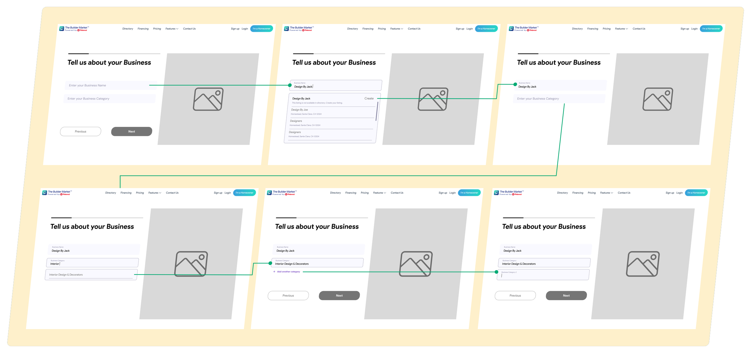
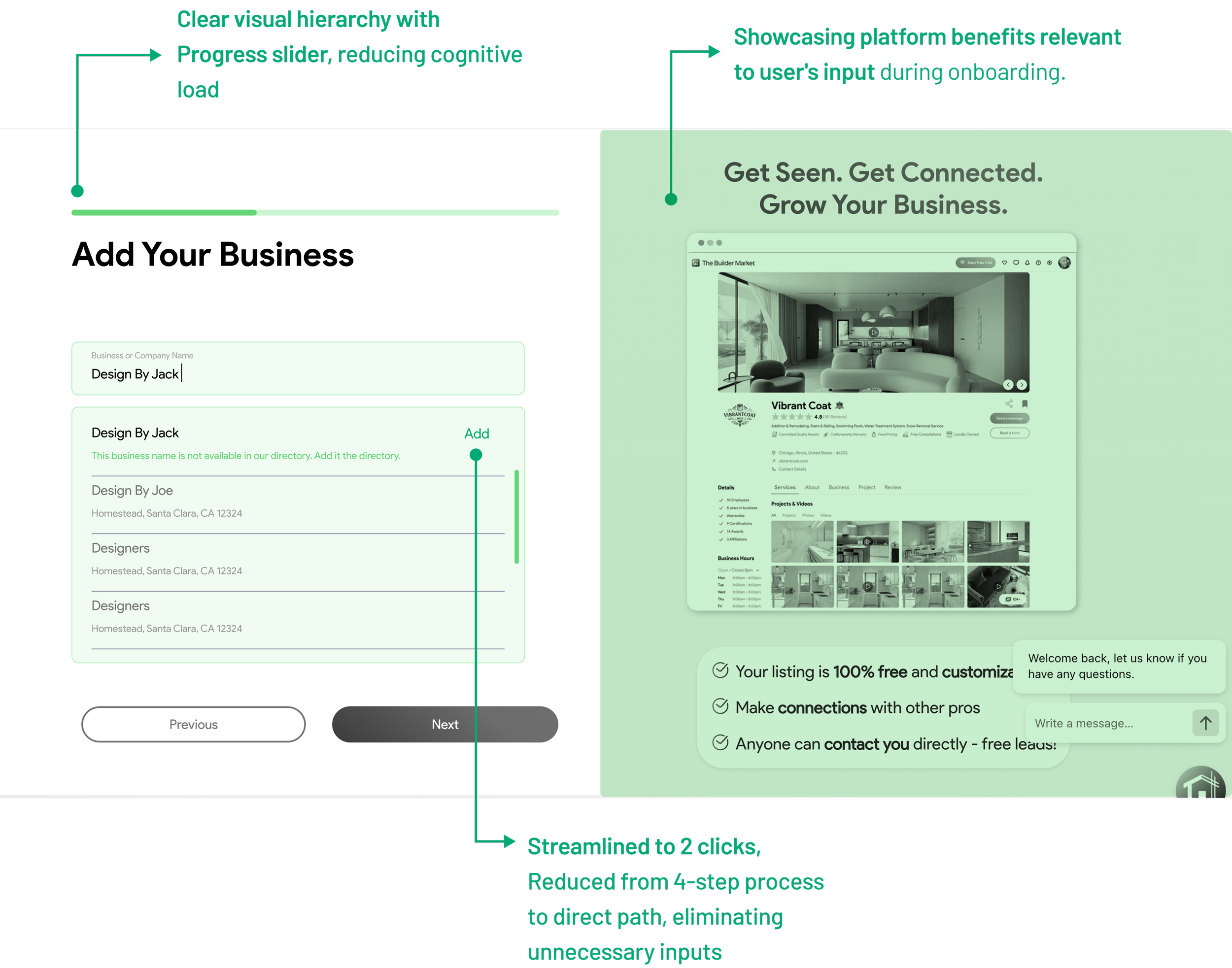
Rather than requiring users to complete the entire listing before experiencing benefits, we designed a task flow that collects just enough business information to personalize the dashboard.

This allows users to experience Builder Market's value firsthand upon landing (on dashboard), motivating them to complete their full listing.

After experiencing the platform's value, users are strategically nudged through the dashboard to complete their remaining listing details

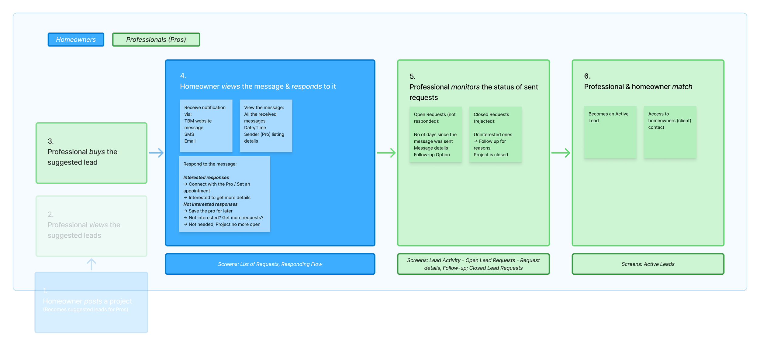
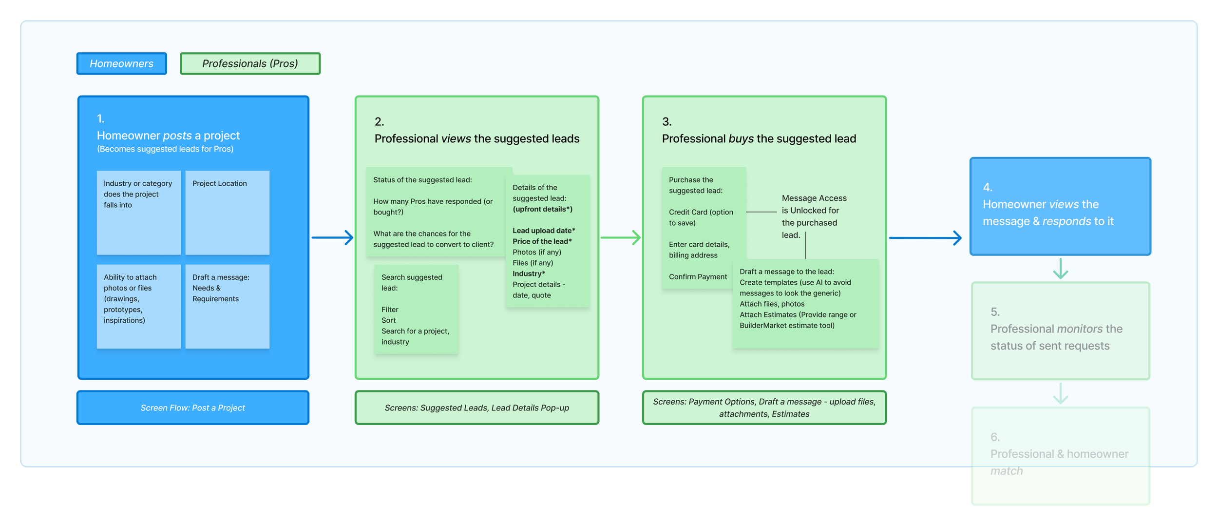
CHALLENGE 2/2:LEAD CONVERSION 0 TO 1
We began brainstorming & ideating flows for a gated lead purchase-contact process
Rather than requiring users to complete the entire listing before experiencing benefits, we designed a task flow that collects just enough business information to personalize the dashboard.
After experiencing the platform's value, users are strategically nudged through the dashboard to complete their remaining listing details
We redesigned the onboarding process to transform the experience from effort-before-value to immediate ROI demonstration and increase platform adoption.
06. SOLUTION OVERVIEW
SOLUTION 1/3
Before
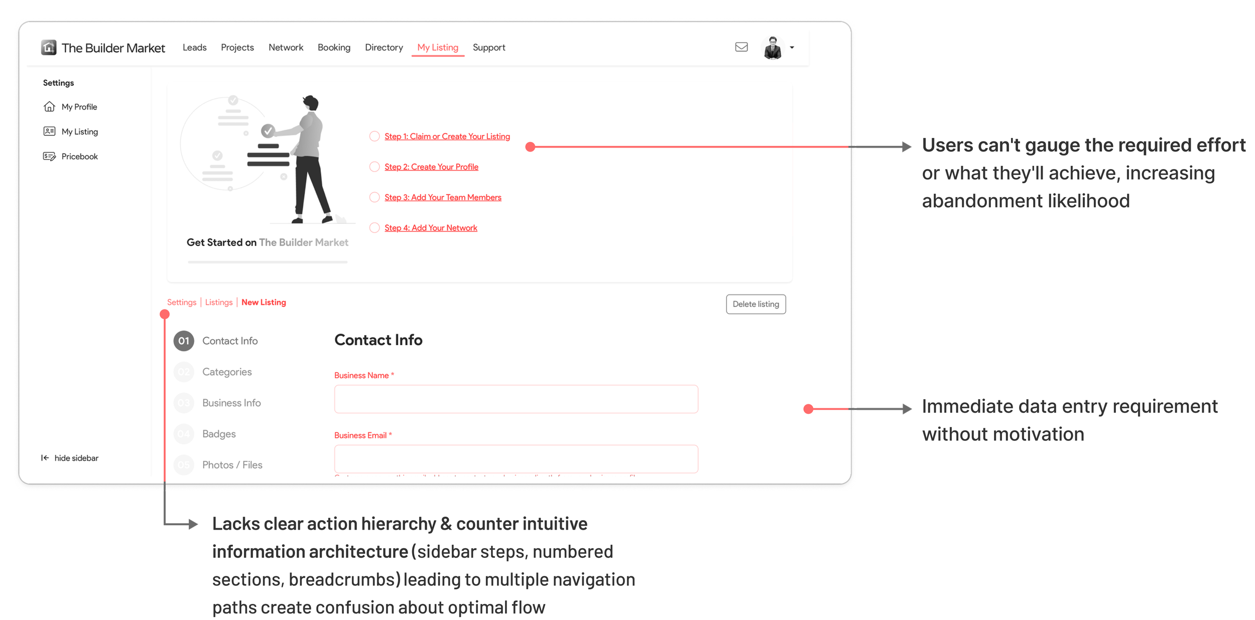
Missing Onboarding and Progress Guidance
Users landed on listing forms after signup without platform introduction or completion expectations. Conflicting navigation elements and no progress indicators created uncertainty about required effort, driving abandonment.
After
Minimal data collection to demonstrate platform value
Integrated marketing content strategically while collecting minimal essential data. Added progress indicators, logical grouping, and progressive disclosure—additional service categories appear only after adding the first one, reducing cognitive overload.

SOLUTION 2/3
Before
Excessive Unnecessary Friction in Search Process
The modal lacked actionable button copy, forcing users to read through the extensive content before discovering how to proceed.

After
Contextual Value Demonstration
Users see relevant value propositions based on their business input, with clear progress indicators guiding them through minimal required steps before accessing the dashboard.
SOLUTION 3/3
Before
Poor Information Hierarchy
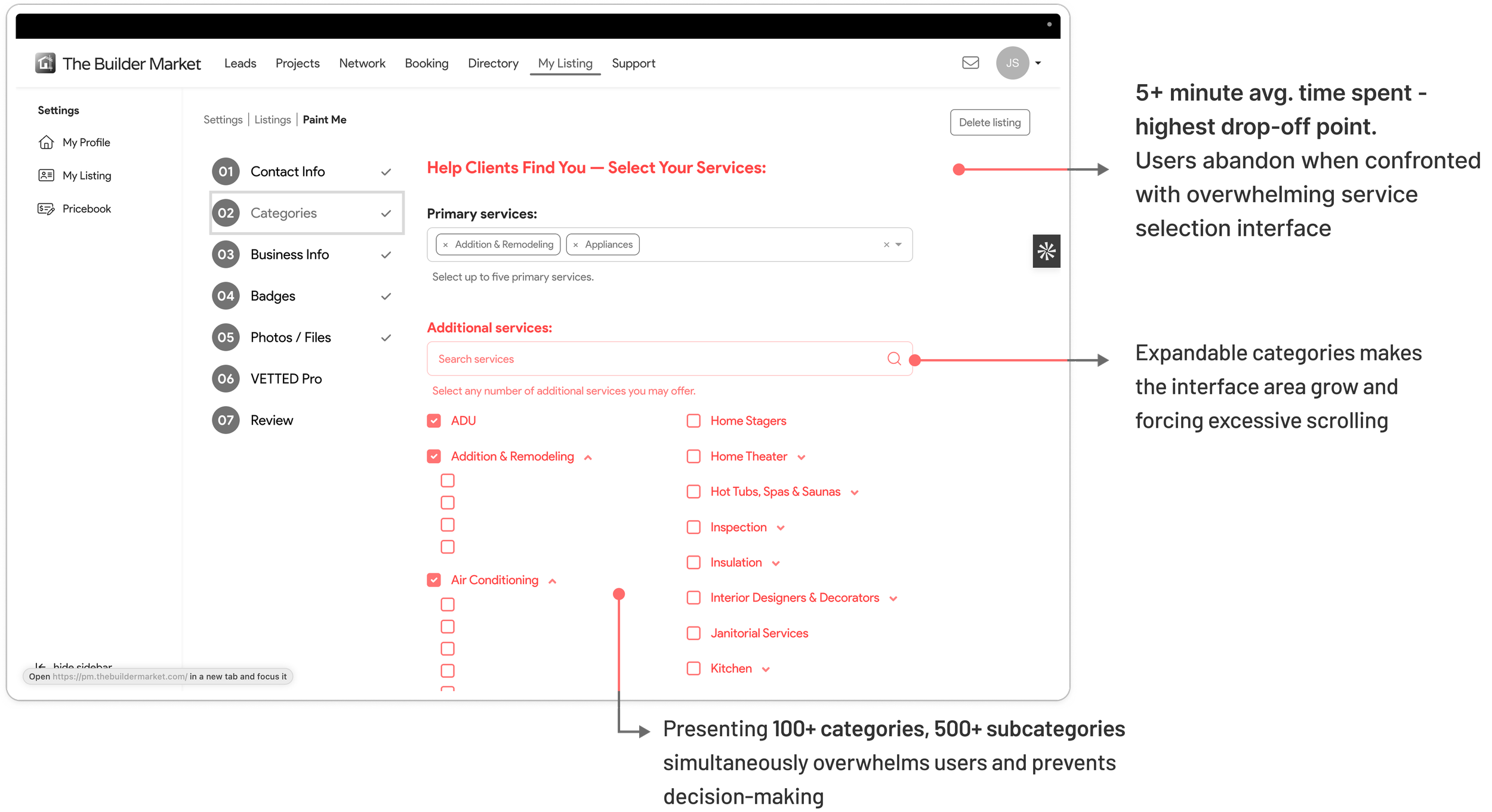
Builder Market allowed professionals to add comprehensive service offerings, but the flat hierarchy of services created decision paralysis.

After
Dynamic Search-Based Category Selection
Integrating progressive disclosure of additional service categories , instead of scrolling through 100+ categories and 500+ subcategories, enabled faster onboarding and immediate access to relevant leads.
07. REFLECTION
Proposing structure in startup environments proved essential.
By proposing ownership of the design driven metric and aligning it with business goals early provided structure to an otherwise open-ended internship and ensured my design decisions connected to measurable outcomes.
Focus on impact over perfection.
Limited resources forced prioritization of foundational UX decisions over visual polish, focusing on patterns that would drive measurable business impact.

Integrating Two-Wheeler Vehicle Service Workflows for Optimal Operations and Faster Delivery
SERVICE DESIGN
ENTERPRISE DESIGN
NEXT PROJECT
Shipped • 2023